Decorative Candles That Won’t Ruin Your Bookshelf: Size, Color, and Drip Guide
Decorative candles can make a bookshelf look considered or crowded, and the difference is rarely the candle alone. It is the relationship between the candle, the shelf, and the objects around it. A tall taper beside a low stack of art books reads differently from the same taper in a narrow alcove. Color matters, too, but not in the way most shoppers expect: the goal is not to match the room exactly, but to give the shelf a calm rhythm. Then there is drip behavior, the practical detail that separates a candle you enjoy lighting from one you avoid because it leaves wax on a favorite book jacket. Choose with those three things in mind—scale, color, and drip—and your display will still work when the flame is lit.
Begin With the Shelf, Not the Candle
Measure before you shop. Note the shelf height and depth, and the distance between fixed shelves. A candle should not fill the vertical gap; it needs air above the flame and clearance from the shelf above. On a standard bookcase, a 4- to 6-inch pillar is often the easiest starting point, especially on a shelf with books. A 9-inch pillar can work on a deeper lower shelf, but it will overpower a narrow upper shelf. For tapers, the holder adds height, so judge the combined object, not the candle alone.
Think in groups. A single large candle can anchor a shelf, but it needs support: a small stack of books, a bowl, a framed print. Odd numbers tend to look relaxed, but the real rule is visual weight. If the candle is heavy, balance it with a broader object or a darker book spine. If it is slender, group it with two smaller objects rather than leaving it stranded.
A simple proportion check
The candle should be roughly one-third to one-half the height of the tallest object in its grouping. Keep table candles below eye level, especially on a dining table, so they do not block conversation. On a bookshelf, leave at least a few inches between the top of the flame and the shelf above. That gap is not wasted space; it is what keeps the arrangement from feeling stuffed.
Color That Belongs on the Shelf
Start with the room’s undertone rather than its paint color. Warm whites, cream, ivory, honey, tobacco, charcoal, moss, and oxblood are forgiving because they echo what is already in many interiors. A shelf packed with colorful books already has a palette; choose candle colors that repeat one or two of those notes. If the books are neutral, add one accent, such as a single olive candle among cream pillars. Avoid scattering too many saturated colors. They compete with book spines and small objects, and the shelf starts to look like a shop display rather than a place to read.
Consider the unlit and lit states. Pale candles look soft in daylight but can appear flat when burning; deep colors look rich unlit but may cast less glow. Test a candle in the actual spot if you can. For bookshelves, unscented or lightly scented candles are often kinder: paper and dust absorb scent, and a strong fragrance can clash with the room. If you want scent, place it on a table or console rather than among books.
Texture counts as color, too. A matte pillar, a glossy ceramic holder, and a brushed metal tray create contrast without adding another hue. If your shelf already has many textures—linen spines, rough pottery, framed photographs—keep the candle finish simple. One smooth surface gives the eye a place to rest.
Drip Behavior Is a Design Decision
Not every decorative candle is meant to drip. Some are made to pool cleanly inside a wax well; others are designed for the sculptural, uneven look of wax running down the side. Neither is wrong, but they suit different places. Near books, choose candles described as low-drip or non-drip, and place a tray or holder with a rim underneath. A candle that drips beautifully on a stone table can ruin a stack of paperbacks.
Drip depends on wax hardness, wick size, room drafts, and how long the candle burns. A candle left near a heating vent or open window may tunnel, smoke, or drip even if it behaves well in a still room. Pillars and tapers also behave differently. A well-made pillar should burn down inside a wax well; if the wick is too large, wax spills over the edge. Tapers are more likely to drip, especially in a draft. If you want the look of tapers near books, use a deep holder or place them on a wall shelf away from paper. Never burn a candle directly beneath a shelf above it; heat rises and can mark the underside.
How to read a candle before you burn it
- Wax type: Harder waxes generally hold their shape and drip less than soft, oily waxes.
- Wick size: A wick that looks oversized for the candle is a warning sign for spilling and smoking.
- Finish: A slightly powdery or matte surface often suggests a firmer wax; a very glossy, soft surface may pool quickly.
- Holder: A rim, a deep cup, or a wide plate gives melted wax somewhere to go.
Test burn before committing. Trim the wick to about a quarter inch, place the candle on a heatproof surface away from books and curtains, and burn it for an hour or two while you are nearby. Watch the first burn. A candle that smokes, flickers wildly, or spills wax on the first burn will likely do it again. If it tunnels, the wick may be too small; if it drips, the room or the wick is too much for the wax.
Styling Shelves and Tables Without Clutter
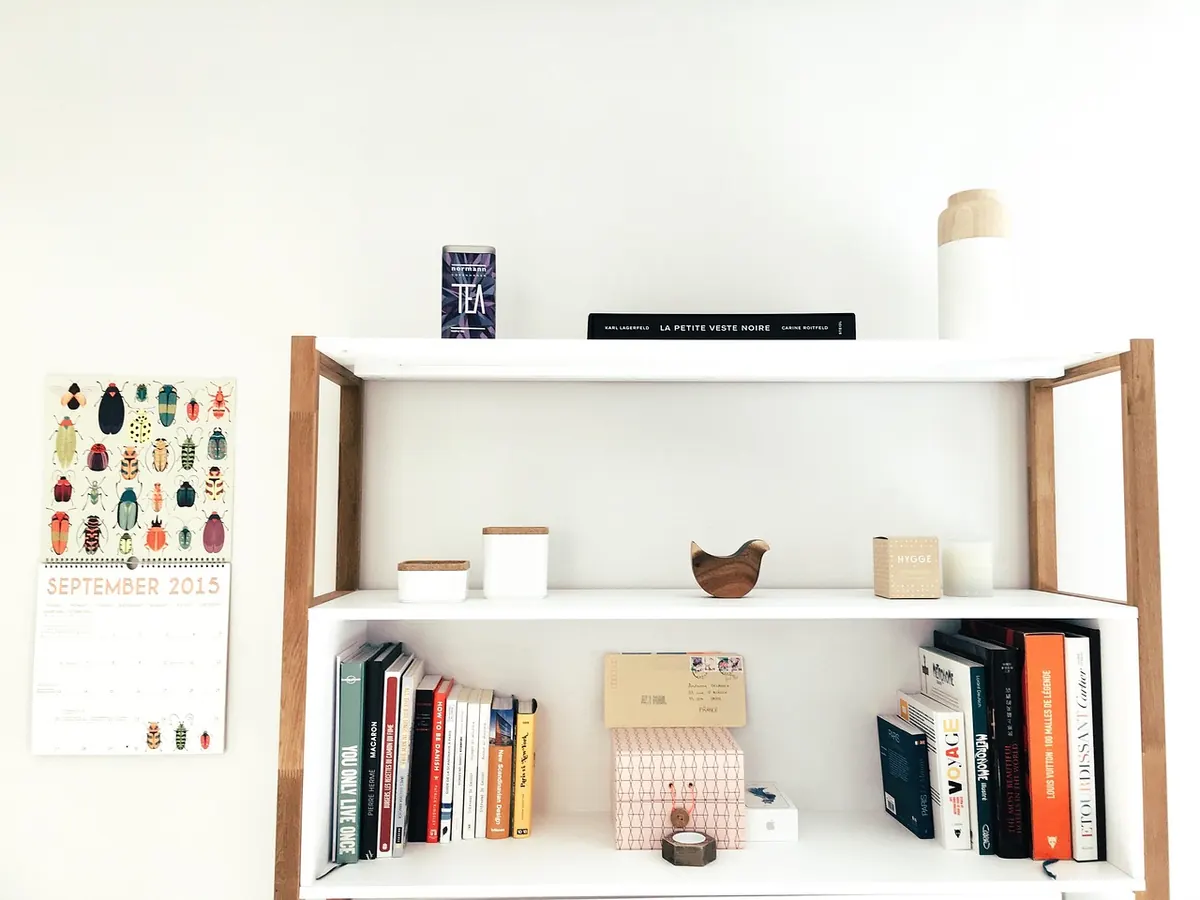
On a shelf, work from back to front. Tall books and art sit at the back, the candle grouping comes forward, and a small object bridges the two. Leave negative space at one end. Do not line up candles like soldiers; vary height by an inch or two and let one object overlap another slightly. A candle placed in front of a dark book spine will disappear, while the same candle against a pale wall will read as a deliberate shape.
On a table, keep the centerpiece low and wide. A tray corrals candles, a small bowl, and a couple of stems without making the table feel off-limits. If you use tall tapers at dinner, set them to one side or choose a holder that keeps them out of the sightline. A table arrangement should look just as good with the candles unlit, because most of the time that is how you will see it.
Rotate one object rather than restyling the whole shelf. Swap a cream pillar for a charcoal one, or replace a small bowl with a single bud vase. That small change keeps the display from going stale without turning it into a weekly project.
A Buying and Test-Burn Checklist
- Measure shelf height, depth, and clearance above the flame before choosing a size.
- Pick one visual anchor and no more than two candle heights for the grouping.
- Choose two or three colors drawn from books, art, or the room’s undertone.
- Confirm the candle is low-drip, or commit to a tray with a rim.
- Check that the holder is stable, heatproof, and wide enough for the candle base.
- Test burn away from books, paper, and curtains, and note how the wax behaves.
- Keep a wick trimmer and a candle snuffer nearby so the display stays easy to use.
Keep the Display Useful, Not Untouchable
The best decorative candles on a bookshelf are the ones you actually light. That means leaving a little clearance, choosing a holder that catches wax, and keeping the arrangement simple enough to dust. A candle that is too tall for its shelf, too soft for its spot, or too precious to burn is decoration in name only.
Candles are a fire risk, so treat the display with respect. Burn them on a heatproof surface, keep them away from books, paper, curtains, and drafts, and never leave a room with a candle still burning. With the right scale, a restrained palette, and a realistic idea of how the wax will behave, your shelf can look composed in daylight and warm in the evening—without a wax stain in sight.
Photo: Pexels / Pixabay


You Might Also Like
Six clear signs that a candle has reached the end of its useful life, plus practical steps for clearing out the leftover wax and giving the jar a second life.
Italian craft markets teach you to judge decorative candles by finish, wax behaviour and a maker's honest answers—before packaging and marketing get in the way.